Creating widgets and a dashboard#
This is the final step in building your first data pipeline. With your data collected, harmonized, and loaded into a warehouse, you can now create visualizations and dashboards to explore and share your insights.
Introduction#
- What is a widget?
A widget is a table or chart that displays your data. Chart widgets are also called visualizations.
- How do I create a widget?
To create a widget, you need your data to be loaded into a warehouse. Once your data is available for analysis, start creating widgets with Explore.
- What types of widgets can I create in Adverity?
Widgets that display your data can be tables or charts. There are a number of chart widget options in Explore, including bar and line charts, geo maps, KPI boxes, and more.
When you create a dashboard, you can also add image, text and videos as widgets. These types of widgets do not include any of your data.
- What is a dashboard?
A dashboard is a space for you to add widgets in order to display related findings. This guide explains how to create a widget and then create a new dashboard containing your widget. However, you can also create a dashboard first, then create and add widgets.
- Can anyone else see my dashboards?
When you create a dashboard, its status is set to private. You can change the status of a dashboard from private to public in order to allow other users in your organization to see the dashboard. For more information, see Making dashboards public.
This video guide explains how to choose the data you want to visualize, create and configure a visualization, and add it to a dashboard.
Creating a table and a visualization#
Note
Make sure your data is loaded into a warehouse before creating widgets. See Loading data into a warehouse.
To create a visualization widget, you must create a data table, configure it so that it contains the data you want to display, select a data set from your data table, and create a visualization.
Creating and configuring a data table#
Go to the Explore page.
Next to the View tabs at the top of the page, click
Create new view.

In the Dimensions & Metrics section on the left, select the dimensions and metrics that you want to display in your widget. You can use the Filter columns field to search for dimensions and metrics by name.
The dimensions and metrics in the Adverity and Time sections are standard dimensions and metrics that can be added to all widgets.
You can use these to display data from a specific data source or data extracts, or over set time periods.
The dimensions and metrics grouped by the data source name are the target fields to which you have mapped the source fields in your datastream.
Use these to choose the data you want to display in your widget.
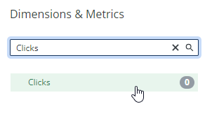
This adds the dimensions and metrics you select to the Data table section of the view. Next, you can customize how this data appears in the table using the following optional steps.
In the Date range row, select a date range for which to display data. Only data from the time period you select here will be shown in the data table.

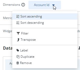
In the Dimensions row, click the name of a dimension to see the options for this dimension, including sorting and filtering.
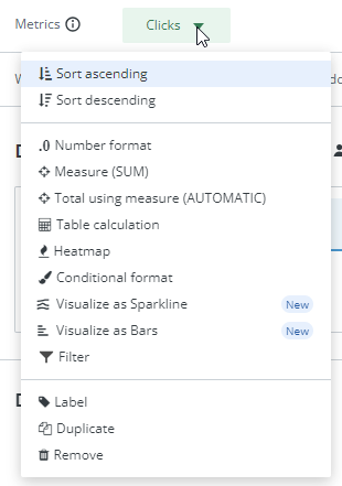
In the Metrics row, click the name of a metric to see the options for this metric, including sorting, filtering, formatting, and conditional formatting.
In the Widget filters row, click the
icons to add a dimension or metric filter to this widget.

Use the options above the table to adjust additional settings, such as limiting the number of rows or adding a total row, or download the table in CSV format.

As a result, you have successfully created and configured a data table so that it contains the data you want to display in your widget.
Selecting a data set#
After creating and configuring your data table, you must select a data set to include in your visualization. To do this, follow these steps:
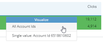
In the data table, click on any value in the column containing the metric you want to visualize. In this example, it is the Clicks column.
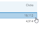
In the pop-up Visualize menu, click the set of values you want to visualize. In this example, to visualize the Clicks metric for all fields in the Account ID column, click All Account IDs.
When you hover over an option in the Visualize menu, Adverity highlights the values that will be included in your visualization if you select this option, as shown by the green highlight in the image below.
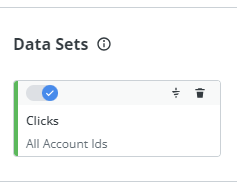
As a result, the set of values you select will be added to the visualization as a data set. You can see the data sets included in your visualization in the Data sets section of the page.
The data in your data set will also appear in the Visualization section of the page. By default, your data first appears as a bar/line chart.
Creating a visualization#
After selecting a data set, you can create a visualization that displays the data in your data set in a format of your choice. To do this, follow these steps:
In the Visualization section of the page, select the type of visualization you want to create.
For a detailed description of each visualization type, see Visualization types.

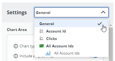
In the Settings panel to the right of your visualization, adjust the visualization settings to meet your needs. The available settings are different for each visualization type.
The drop-down menu at the top of the Settings panel lets you choose the level at which the settings are applied. General settings are applied to the entire visualization. The other options in this drop-down menu are different for each visualization type, but can allow you to apply settings to a single axis, value, or data set (if you have added multiple data sets to one visualization).
As a result, you have successfully created and configured a visualization that displays your chosen data set.
Adding a widget to a dashboard#
Warning
You cannot save the table and visualization that you have created unless you add at least one of them as a widget to a dashboard.
If you do not add a table or visualization widget to a dashboard, they will be lost when you close the View tab or sign out of Adverity.
You can add both the data table and the visualization that you have created to a dashboard. To do this, follow these steps:
In the top right of the View tab containing the data table and/or visualization that you want to add to a dashboard, click Add to dashboard.

In the drop-down menu, select one of the following options:

In the Add to dashboard pop-up window, in the Widget name field, enter a name for your new widget. This will appear as the widget title on your dashboard.
Select one of the following options:
To add your widget to an existing dashboard, click Add to existing dashboard and then in the drop-down menu, select the dashboard to which you want to add the widget.
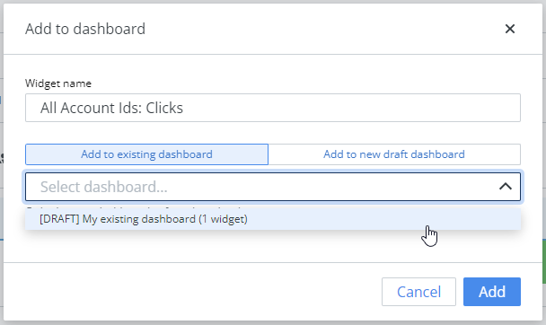
To add your widget to a new dashboard, click Add to new private dashboard and enter a name for your new dashboard.
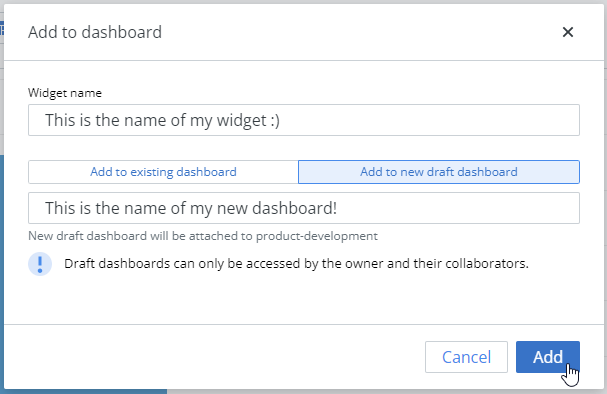
Click Add.
If you want to add both the data table and visualization to the same|dashboard|, follow these steps twice:
The first time, select Add as table and Add to new private dashboard.
The second time, select Add as visualization and Add to existing dashboard, then select the dashboard you just created.
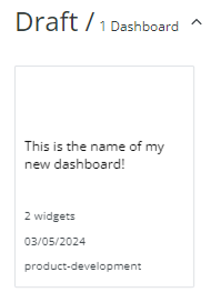
To view the dashboard containing your widget, at the top of the window, click Present. Your new dashboard will appear in the Draft section of the page.
What’s next?#
This is the final guide in the Getting Started with Adverity section of the documentation.
For more information about the processes in this guide, see the following pages:
Selecting data to add to a widget contains information on how to configure what data you want to use in the data table, and the guides in this section explain how to apply advanced filters to your data.
Configuring data tables contains information about the Data table options, and the guides in this section explain how to configure more advanced data tables.
Creating visualizations contains information about the different available visualization types, and the guides in this section explain how to create more complex visualizations.
The Present section of our documentation contains more information about customizing your dashboards and adding different content, such as images and videos.
Well done!#
You’ve completed the Getting Started guides and built your first data pipeline. You now know how to:
Create a datastream to collect data from a data source
Apply Data Mapping to harmonize data from different sources
Load data into a warehouse and external destinations
Create widgets and dashboards to visualize your data
Continue exploring#
Now that you have the fundamentals, here are some ways to get more out of Adverity:
- Get insights with Data Conversations
Query your data using natural language. See Using Data Conversations.
- Share your dashboards
Make your dashboards available to others in your organization. See Publishing dashboards.
- Transform your data
Clean, enrich, and modify data to meet your needs. See Transforming data in Adverity.
- Monitor data quality
Set up automated checks to catch issues early. See Introduction to the Data Quality page.
- Use Default Data Mapping
Save time on future datastreams with connector-provided mapping defaults. See Default Data Mapping.
- Optimize performance
Monitor task health and identify bottlenecks as you scale. See Using the Performance Manager.