Configuring bar, line, and scatter chart widgets#
This guide explains how to configure bar, line, and scatter chart visualization widgets for more complex use cases.
Introduction#
Bar and line charts are two of the available visualization options in Adverity. You can add a visualization widget to a dashboard to present your data.
This guide explains how to configure some more complex settings for these visualization types in order to achieve the following goals:
Prerequisites#
Before you complete the procedure in this guide, perform all of the following actions:
Fetch the data you want to include in your visualization widget. For more information, see Collecting data in Adverity.
Note
If you want to create a stacked bar chart as described in this guide, ensure that you fetch data for at least two months.
Apply the correct Data Mapping to your datastreams. For more information, see Applying Data Mapping to a datastream.
Configure the data table to choose how the selected data is displayed in the data table.
Configuring advanced bar and line chart settings#
This guide explains how to configure a line chart. The steps for configuring a bar chart are very similar.
Note
When configuring settings for a visualization widget, the settings level you choose in the Settings section to the right of the chart determines how the configured setting will be applied:
General settings are applied to the whole chart.
Axis settings are applied to all data sets on the configured axis.
Data set settings are applied to the selected data set and all data series within it.
Data series settings are applied to the selected data series in the data set.
To configure a line chart, follow these steps:
In the settings level drop-down menu, select General. Configure the following settings for the whole chart:
In the Chart type drop-down menu, select the visualization type.
In the Markers drop-down menu, choose how to display markers. Markers identify individual data points on the line chart. The following options are available:
Auto - adjust the markers for better visibility. Some markers may be omitted if there are too many data points.
On - display all markers.
Off - hide all markers.
In the Data Labels section, enable the Show data labels toggle, then configure the labels on the chart. The following options are available:
Normal - labels show the absolute values of the data points.
Percent of visible total - labels show the data points as percentages of the total of all currently visible values for the point on the x axis. This option does not include data series that were hidden from the chart.
Percent of total - labels show the data points as percentages of the total of all values for the point on the x axis, including hidden data series.
Percent of stack total - on bar charts, the labels show the data points as percentages of the sum of all values on the stack for the point on the x axis. If stacking is not configured, each y axis is considered to be on a separate stack including all data series on this axis. For more information about stacked bar charts, see Creating a stacked bar chart.
In the settings level drop-down menu, select the x axis. This option will be named after the dimension shown on the x axis. Configure the name, visibility, position and label settings for the x axis.
In the settings level drop-down menu, select the y axis. This option will be named after the metric shown on the y axis. If your visualization displays data for more than one metric, you will have more than one y axis option.
Configure the following settings for the y axis. These settings will be applied to all data sets on the selected y axis:
In the Axis Properties section, configure the settings for the selected y axis.
In the Data Labels section, configure how the data in all data sets using this axis is labeled.
In the settings level drop-down menu, select a data set. These will be named after the metric and dimension that make up this data set, e.g. Clicks: All campaign names. If your visualization displays data for more than one data set, you will have more than one data set option.
Configure the following settings for the selected data set:
In the Chart Area section, configure the visual settings for the selected data set.
In the Chart Area section, enable the Flatten data points toggle to create unique data points on the x axis for each combination of the selected dimensions. This setting only affects charts that display more than one dimension.
In the Data Labels section, configure how data in the selected data set is labeled.
In the Axis section, select the x axis on which your selected dimension should be shown, and the y axis on which your selected data series should be shown. This setting allows you to visualize multiple dimensions or metrics on one axis. To see an example of a chart that uses this option, see Visualizing potential impressions.
In the settings level drop-down menu, select a data series. These are the lowest-level chart settings options and are shown using the
icon. If your visualization displays data for more than one data series, you will have more than one data series option.
Configure the following settings for the selected data series:
In the Series Properties section, configure the visual settings for the selected data series.
In the Data Labels section, configure how the data in the selected data series is labeled.
In the Axis section, select the x axis on which your selected dimension should be shown, and the y axis on which your selected data series should be shown. This setting allows you to visualize multiple dimensions or metrics on one axis. For an example that uses this option, see Visualizing potential impressions.
As a result, you have created a line chart visualization widget . You can now add it to a dashboard - for more information, see Adding a widget to a dashboard.
Creating a stacked bar chart#
Stacking allows you to visualize the values of a metric over two dimensions. For visual examples of stacking types, see the examples shown below this guide.
To create a stacked bar chart visualizing a metric for each month, you must fetch data for the metric for at least two months, and load this data into Data Warehouse.
Configuring a stacked bar chart visualization#
To select a data set and then configure a stacked bar chart visualizing a metric for each month, stacking according to a dimension, follow the steps below.
This guide uses the Impressions metric stacked according to the Datasource dimension as an example.
In the data table, in any month row, click on one of the values in the dimension column to see visualization options. Click Months by [|dimension|].
In our example, we click on any month value in the Impressions column, then click Months by Datasource.
In the settings level drop-down menu, select General. Next, in the Chart type drop-down menu, select the
Bar chart icon.
In the settings level drop-down menu, select the y axis, and configure the following settings for the y axis.
In our example, the y axis is named Impressions.
In Stacking, select the stacking mode you want to use:
Normal - the data set values are stacked as a sum of the values.
Percent - the data set values are stacked as a percentage of the total sum of the values. When using Percent, each bar represents 100% of the total sum.
In Stack, select the stack onto which the values on the selected axis should be stacked. The default stack is 0.
When there is only one axis on the chart, changing the selected Stack has no effect.
When there are two or more axes on the chart, you can combine stacks for several axes into one by selecting the same Stack.
Enable Stacking labels to display the total sum of the stacked values for the visible data series.
In the settings level drop-down menu, select the data series. This is the lowest level of the settings level drop-down menu. Configure the following setting:
In our example, the data series are named after the Datasource dimension.
In Stack, select the stack onto which the selected data series should be stacked. The default stack is 0.
For example, if there are three data series in the data set, you may want to stack two of them and leave the third one in a separate bar. In this case, select the same stack for two data series, and a different stack for the third data series.
As a result, you have created a stacked bar chart visualization widget . You can now add it to a dashboard - for more information, see Adding a widget to a dashboard.

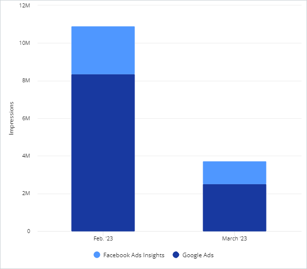
Example of a bar chart visualization of the Impressions metric for two dimensions (Datasource and Month) with Normal stacking. The values are stacked as a total sum of the Impressions values for each month.

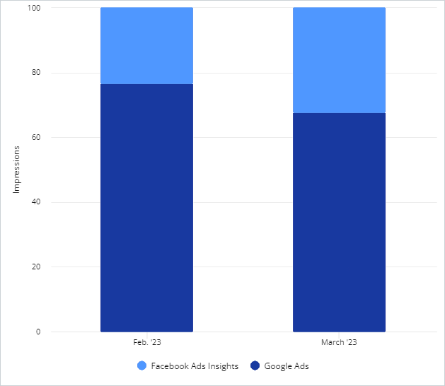
Example of a bar chart visualization of the Impressions metric for two dimensions (Datasource and Month) with Percent stacking. The values are stacked as percentages of the total sum of the Impressions values for each month. Each bar represents 100% of the total sum for each month.
Displaying multiple data sets in different ways#
When you select a visualization data set, Adverity creates a bar chart widget displaying your data. You can add multiple data sets to a visualization. You can choose to display each data set in a different way in order to visualize data more easily.
To display two data sets in different ways, follow these steps:
Create a data table containing the data you want to display, and select at least two data sets to visualize.
In the settings level drop-down menu, select one data set, and in the Chart type drop-down menu, select a type, for example Line.
In the example below, the Conversions: Months of Google Ads data set is a line chart.
In the settings level drop-down menu, select one data set, and in the Chart type drop-down menu, select a type, for example Bar.
In the example below, the Clicks: Months of Google Ads data set is a bar chart.
Note
The data set that is listed first in the Data sets section of the Explore page is displayed on top. To change the order in which data sets are displayed, drag and drop the data sets into the required order.
In the example below, the Conversions data set is listed before the Clicks data set, so that the line chart is displayed on top of the bar chart.
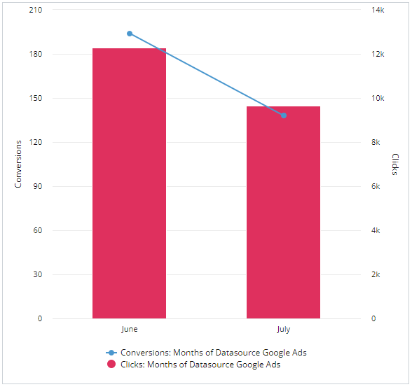
As a result, the chart widget displays two data sets in two different ways that make your data easy to view. In the example below, both data sets are displayed in different ways, which helps to visualize the changes over time.

In this example, the Conversions data set is displayed as a line chart, and the Clicks data set is displayed as a bar chart.