Creating geo map widgets#
This guide explains how to create a geo map widget.
Introduction#
A geo map widget displays values for a metric (e.g. clicks or impressions values) on a map, showing where the events counted by this metric took place. This guide explains two ways to display data on a geo map widget. These two methods require you to use different transformations and data sets.
- Create a geo map widget to display bubbles on a map
This geo map displays the chosen metric as a bubble on the map, where the larger the bubble, the bigger the metric value. This option requires latitude and longitude data values.
- Create a geo map widget to display a regional heat map
This geo map displays the chosen metric as a heat map across the regions of the relevant country. This option requires ISO region codes to populate the geo map.
Creating a geo map widget to display bubbles on a map#
Introduction#
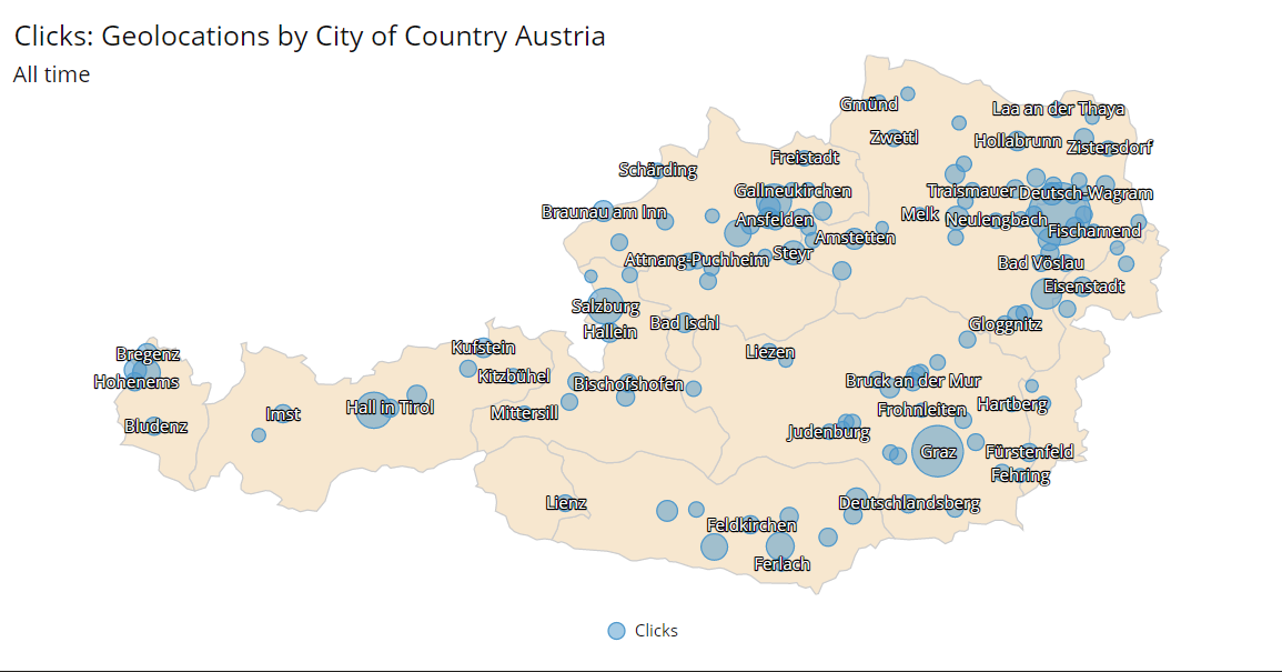
The example geo map widget below displays the number of clicks an ad received in cities in the country of Austria. Each of these cities is represented as a bubble, where the bigger the bubble, the more clicks an ad received. For example, Graz has a bigger bubble compared to Lienz, showing more ad clicks in Graz compared to Lienz.

A Geo map widget of Austria that displays the number of clicks an ad received within specific cities.
Prerequisites#
Before you complete the procedure in this guide, perform all of the following actions:
Ensure the data source from which you are collecting data contains the following location fields:
Country - This is to display the name of the country in the geo map title.
City - This is to display the names of the cities on the geo map.
Latitude - This is used to create the required geolocation dimension.
Longitude - This is used to create the required geolocation dimension.
(Optional) To increase performance when displaying data, ensure the latitude and longitude values are set to no more than two decimal places. Create a transformation script that rounds the latitude and longitude values to two decimal places. For more information, see Creating rounding transformation script. If you choose to use the rounding transformation script, ensure it runs before the geolocation-creation script.
Create a transformation script that combines the latitude and longitude values into a single dimension. This dimension is called geolocation. For more information, see Creating geolocations transformation scripts.
Ensure that the data extract contains the following metrics and dimensions:
country(dimension)city(dimension)geolocation(dimension created with transformation script)The metric to be displayed in the geo map (for example, Clicks or Impressions)
Creating a geo map widget showing bubbles#
To create a geo map widget that displays bubbles on a geo map, follow these steps:
Go to the Explore page.
Next to the View tabs at the top of the page, click
Create new view.
In the Dimensions & Metrics menu, select the following dimensions and metrics:
Dimensions: Country, City, Geolocations
The metric you want to display on the geo map (e.g. Clicks)
At the top of the view, in the Dimensions panel, ensure the dimensions are in the following order:
Country > City > Geolocations
In the Data table section of the page, in the table, click on one of the values in the Geolocations row within the Clicks column to see visualization options. Click Geolocations by City of Country {Country Name}.
Note
This guide uses Austria as the {Country Name}, so the visualization option would be Geolocations by City of Country Austria.
In the Visualization section of the page, above the visualization widget that you have created, click
Geo map.
As a result, a geo map widget is created, displaying your chosen metric (in this example, Clicks) next to the corresponding cities.
Configuring a geo map widget to display city names#
To configure the geo map widget to look like the example shown above, follow these steps:
In the settings level drop-down menu, select General and configure the following settings:
In Region, select the country to display in the geo map widget. This guide uses Austria as an example.
In the settings level drop-down menu, select your data set and configure the following settings. In this example, the data set is called Geolocations by City of Austria.
In Flatten data points, enable the toggle.
(Optional) In Metric name, change the name of the metric displayed in the geo map widget. This guide uses Clicks as an example.
In Data labels, enable the Show data labels toggle.
In the settings level drop-down menu, select General and configure the following settings:
In Data labels, enable the Data labels name toggle. This displays the name of the city next to the metric bubble.
(Optional) In Data labels, disable the Data labels value toggle. This hides the metric value from the data label so only the city name is displayed.
As a result, the geo map widget has been configured and will look like the example above. You can now add the widget to a dashboard. For more information, see Adding a widget to a dashboard.
Creating a geo map widget that displays a regional heat map#
Introduction#
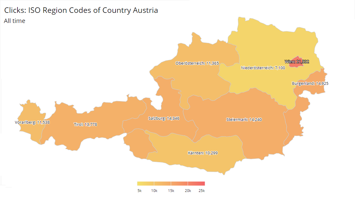
The example geo map widget below displays the number of clicks an ad received in regions across the country of Austria as a heat map. Each of these regions is represented with a color corresponding to the number of ad clicks, where the stronger or hotter the color of the a region is, the more ad clicks took place there. For example, the Austrian region Wien is more red compared to Tirol, showing that there were more ad clicks in Wien compared to Tirol.

A Geo map widget of Austria that displays the number of clicks an ad received as a region heat map.
Prerequisites#
Before you complete the procedure in this guide, perform all of the following actions:
Ensure the data source from which you are collecting data contains the following location fields:
Country - This is to display the name of the country in the geo map title.
Region - This is so a mapping table will match a region to the correct ISO region code.
Create a mapping table with the ISO region codes for the country to display as a geo map. This guide uses Austria as an example. For more information, see Creating a mapping table that contains ISO region codes.
Create a transformation script that applies the mapping table to the data extract to create the required dimension. This dimension is called ISO region code. For more information, see Creating a transformation script to add ISO region codes to your |data extract|.
Ensure the data extract contains the following metrics and dimensions:
country(dimension)iso region code(dimension created with transformation script)The metric to be displayed in the geo map (for example, Clicks or Impressions)
Creating a geo map widget with a heat map#
To create a geo map widget that displays a regional heat map, follow these steps:
Go to the Explore page.
Next to the View tabs at the top of the page, click
Create new view.
In the Dimensions & Metrics menu, select the following dimensions and metrics:
Dimensions: Country, ISO Region Code
The metric you want to display on the geo map (e.g. Clicks)
At the top of the view, in the Dimensions panel, ensure the dimensions are in the following order:
Country > ISO Region Code
In the Data table section of the page, in the table, click on one of the values in the ISO Region Code row within the Clicks column to see visualization options. Click ISO Region Code of Country {Country Name}.
Note
This guide uses Austria as the {Country Name}, so the visualization option would be ISO Region Code of Country Austria.
In the Visualization section of the page, above the visualization widget that you have created, click
Geo map.
As a result, a geo map widget is created, displaying your chosen metric (in this example, Clicks) next to the corresponding cities.
Configuring a geo map widget to display region names#
To configure the geo map widget to look like the example shown above, follow these steps:
In the settings level drop-down menu, select General and configure the following settings:
In Region, select the country to display in the geo map widget. This guide uses Austria as an example.
In the settings level drop-down menu, select your data set and configure the following settings. In this example, the data set is called ISO Region Code of Country Austria.
(Optional) In Metric name, change the name of the metric displayed in the geo map widget. This guide uses Clicks as an example.
In Data labels, enable the Show data labels toggle.
In the settings level drop-down menu, select General and configure the following settings:
In Data labels, enable the Data labels name toggle. This displays the name of the region within the relevant section of the map.
(Optional) In Data labels, disable the Data labels value toggle. This hides the metric value from the data label so only the region name is shown.
As a result, the geo map widget has been configured and will look like the example above. You can now add the widget to a dashboard. For more information, see Adding a widget to a dashboard.